Toronto graphic designer and illustrator. Specializing in branding, print, packaging, and web design.

I designed and built this site early in my career (back when everything was coded from scratch and services like Squarespace and Shopify didn't exist). It's out-dated in terms of usability now, but it was a project I very much enjoyed and still find rather easy on the eyes.
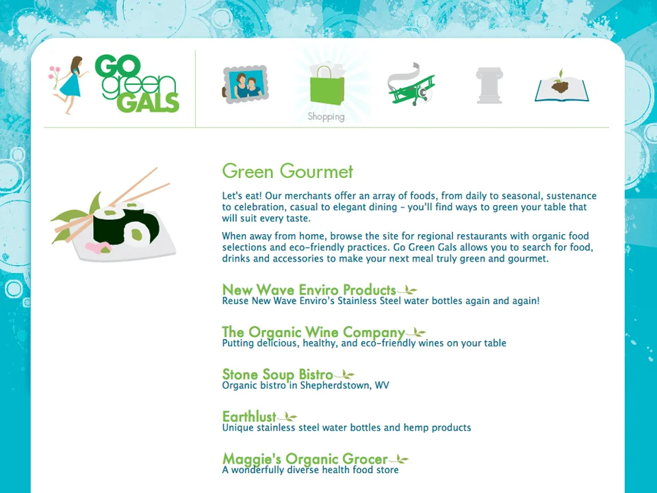
The owners of Go Green Gals had the business model and logo in place and approached my firm when they were ready to take it online. The goal of the site was to connect businesses and farms to consumers looking for local and environmentally-friendly suppliers. The businesses would pay to advertise on the site and buyers could search for what they needed. Building off their pre-existing logo, I created numerous illustrations and a fun, colourful world to make the experience a delight.
Spot illustrations for the Go Green Gals website.
This was my first project in packaging design and remains one of my favourites. I am particularly fond of how the slight modification of the six-pack’s sides forms the bishop’s hat, which creates a fun surprise and makes it sure to stand out on the shelf.
When I found these little music box mechanisms, they came in unremarkable packages. The goal of my redesign was to create carriers as delightful as the palm-sized joy they hold. Each individual style is designed to have a unique image to symbolize its song with colour coordinated accents for easy identification when on display.